UIComponents
Table of contents
Prior knowledge
All ui /components inherit from ComponentView. It is therefore helpful to read this documentation first as the features from this superclass doesn’t get repeated here.
Introduction
A UIComponent may be used to present information to the user or retrieve input. There are three base classes for UIComponents.
- UIComponent: the baseclass for all UIComponents
- LabeledUIComponents: extends UIComponent and provides additional fields to define a text e.g., a Button with a text.
- TextInputUIComponents: extends UIComponent and provides a text input field for user defined text.
NOTE: UIComponents are ComponentViews. This means all methods of handling user input discussed in the User Input Guide are also available to UIComponentViews.
This is a visual example of all the available UIComponents in the framework. Parts of the source code will be used in this tutorial to demonstrate the most important features of each UIComponent. The full source code can be found here:
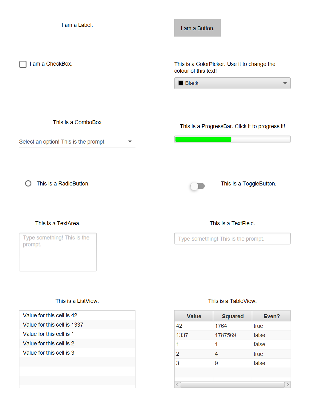
Label
A Label is just a simple text. In this example a new label is instantiated with the text “I am a Label.”, aligned to the center and with text wrapping enabled. Enabled text wrapping allows the text to wrap onto a new line if the width of the label is too small for the text.
private val outputLabel = Label(
	posX = 50,
	posY = 50,
	width = 300,
	text = "I am a Label.",
	alignment = Alignment.CENTER,
	isWrapText = true
)
Button
A Button is a component that plays an animation when a mouse click is performed over the button. Additionally, a text may be defined to describe the button. In this example a new button is instantiated, and the onMouseClicked is set, so that the outputLabel displays “Someone pressed the Button!”.
val button = Button(posX = 450, posY = 50, text = "I am a Button.", visual = ColorVisual.LIGHT_GRAY)

button.onMouseClicked = {
	outputLabel.text = "Someone pressed the Button!"
}
CheckBox
A CheckBox is a component that can be checked or unchecked. It can be enabled to allow an indeterminate state. This can be used to express uncertainty. Whenever a CheckBox is clicked it changes its state in the following order:
if indeterminate is not allowed
checked | isIndeterminate |
|---|---|
false | false |
true | false |
if indeterminate is allowed
checked | isIndeterminate |
|---|---|
false | false |
false | true |
true | false |
NOTE: it is possible to set isIndeterminate to true even when indeterminate is not allowed. It is just impossible to reach the indeterminate state via clicks on the CheckBox.
In this example, listeners are added to the checkedProperty and indeterminateProperty, such that outputLabel displays the state of the CheckBox, whenever the state changes.
val checkBox =
	CheckBox(posX = 50, posY = 150, width = 300, text = "I am a CheckBox.", alignment = Alignment.CENTER_LEFT)

checkBox.allowIndeterminate = true

checkBox.checkedProperty.addListener { _, newValue ->
	outputLabel.text = if (newValue) "The check box is checked!" else "The check box is unchecked!"
}

checkBox.indeterminateProperty.addListener { _, newValue ->
	if (newValue) outputLabel.text = "The check box is indeterminate!"
}
ColorPicker
A ColorPicker may be used to enable a user to specify a colour intuitively. The selected colour can be set and retrieved via the selectedColor property. To react to a new selectedColor, a listener may be added to the selectedColorProperty. In this example the text colour of another label is changed, whenever a new colour is picked.
val colorPicker = ColorPicker(posX = 450, posY = 200, width = 300, initialColor = Color.BLACK)

val colorPickerLabel = Label(
	posX = colorPicker.posX,
	posY = colorPicker.posY - 50,
	width = colorPicker.width,
	height = 50,
	alignment = Alignment.CENTER,
	font = Font(color = colorPicker.selectedColor),
	text = "This is a ColorPicker. Use it to change the colour of this text!"
).apply { isWrapText = true }

colorPicker.selectedColorProperty.addListener { _, newValue ->
	colorPickerLabel.font = Font(color = newValue)
}
ComboBox
A ComboBox is a drop-down menu, where a user may choose an option. A prompt may be specified to inform the user, what is expected of him. The ComboBox has a type parameter to define a type for the objects that correspond to the options. One string per contained object is necessary to represent it as an option to the user. There are two methods of obtaining said string.
A formatFunction, that projects the contained objects to a string representation may be set. If no formatFunction is set, the toString function of the contained object is used to obtain a string.
In this example a ComboBox typed to Double with the prompt “Select an option! This is the prompt.” is instantiated. Then the formatFunction is set, so the contained doubles get represented as their Int value with the suffix “Option “.
val comboBox =
	ComboBox<Double>(posX = 50, posY = 350, width = 300, prompt = "Select an option! This is the prompt.")

comboBox.formatFunction = {
	"Option ${it.toInt()}"
}
To define the options simply set the items list. In the example three doubles are set.
comboBox.items = mutableListOf(0.0, 1.0, 2.0)
The selectedItem can be used to retrieve or set the current selected item. To react to a change of the selected item, a listener can be added to the selectedItemProperty. In the example the outputLabel should display the newly selected option whenever it changes.
comboBox.selectedItemProperty.addListener { _, newValue ->
	outputLabel.text = "Combo box selection is : $newValue"
}
ProgressBar
A ProgressBar is a coloured bar that can indicate progress to the user. The current progress and colour can be retrieved and set via progress and barColor respectively.
In this example a new ProgressBar is instantiated and the onMouseClicked is set, such that the progress of the bar is advanced by 5% on a click or reset if the progress is greater than 100%.
NOTE: the progress is modelled as a Double, where any value equal or less than 0 means 0% progress and any value equal or greater than 1 means 100% progress.
val progressBar = ProgressBar(posX = 450, posY = 350, width = 300, progress = 0.5, barColor = Color.GREEN)

progressBar.onMouseClicked = {
	progressBar.progress = if (progressBar.progress > 1.0) 0.0 else progressBar.progress + 0.05
}
Additionally, to react to change to the progress a listener is added to the progressProperty. In this case updating the barColor based on the current progress level.
progressBar.progressProperty.addListener { _, newValue ->
	when {
		newValue > 0.8 -> progressBar.barColor = Color.RED
		newValue > 0.5 -> progressBar.barColor = Color.YELLOW
		else -> progressBar.barColor = Color.GREEN
	}
}
ToggleButton and RadioButton
A ToggleButton can either be selected or not selected. A RadioButton is just a ToggleButton with a different visual representation. It has exactly the same functionalities as a ToggleButton.
To retrieve whether the ToggleButton is toggled on or off the isSelected field can be used.
ToggleButtons have a feature where different ToggleButtons may be linked via a ToggleGroup. ToggleGroups enforce a rule, where only one ToggleButton in a ToggleGroup may be selected at a time. So whenever a ToggleButton in a ToggleGroup changes its selected state to true, all other ToggleButtons in the ToggleGroup automatically have their selected state set to false.
NOTE: Setting a ToggleGroup on a ToggleButton is an exception. The ToggleGroup rule only gets enforced whenever a contained ToggleButton changes its state. So it is technically possible to have multiple selected ToggleButtons in a ToggleGroup by setting the ToggleGroup on multiple pre-selected ToggleButtons.
In this example a new ToggleGroup, Toggle- and RadioButton are instantiated. The toggleGroup is set as the toggleGroup for both buttons.
val toggleGroup = ToggleGroup()

val radioButton = RadioButton(posX = 50, posY = 450, toggleGroup = toggleGroup)

val toggleButton = ToggleButton(posX = 450, posY = 450, toggleGroup = toggleGroup)
To react to change of the selected state, a listener can be added to the selectedProperty. In the example the text of the Label radioLabel gets updated, whenever the selected state of radioButton changes.
radioButton.selectedProperty.addListener { _, newValue ->
	radioLabel.text = if (newValue) "This is a selected radio button!" else "This is a deselected radio button!"
}
TextArea, TextField and PasswordField
TextArea, TextField and [PasswordField][PasswordFieldKDoc] can be used to allow users to type texts. The main difference between TextArea and TextField/PasswordField, is that [TextArea][TextAreanKDoc] has multiple lines of input, while TextField and [PasswordField][PasswordFieldKDoc] only have one. The text can be set and retrieved via text. A prompt can be specified that informs the user, which textual input is requested. To react to user input, a listener on the textProperty can be added. Additionally, the onKeyPressed, onKeyReleased and onKeyTyped handlers are a great way of executing code when textual input occurs. [PasswordField][PasswordFieldKDoc] acts like a TextField but uses stars to display the typed text.
In this example a TextArea, and a TextField with prompts are instantiated and listeners on their textPropertys are added, that update the outputLabel with the current text.
val textArea = TextArea(posX = 50, posY = 600, prompt = "Type something! This is the prompt.")
textArea.textProperty.addListener { _, newValue ->
	outputLabel.text = newValue
}

val textField = TextField(posX = 450, posY = 600, width = 300, prompt = "Type something! This is the prompt.")
textField.textProperty.addListener { _, newValue ->
	outputLabel.text = newValue
}
ListView
A ListView can be used to display a list of strings. The ListView has a type parameter, so any type of objects can be contained in the ListView. By default, the toString() function is applied to the contained objects to obtain a string representation of each object. A formatFunction can be set that gets used instead of the toString() function to obtain the string representations.
In this example, a ListView with initial Int items is created..
val listView = ListView(posX = 50, posY = 800, width = 300, height = 200, items = mutableListOf(42, 1337, 1, 2, 3))
A custom formatFunction is set, so the ListView displays “Value for this cell is” concatenated with the actual value of the contained object.
listView.formatFunction = {
	"Value for this cell is $it"
}
TableView
A TableView can be used to display multiple representations of the same objects in pre-defined columns. The TableView has a type parameter, so any type of objects can be contained in the TableView.
In this example a TableView typed to Int is instantiated.
val table = TableView<Int>(posX = 450, posY = 800, width = 300, height = 200)
Three custom TableColumns are added to the columns list of the TableView. A TableColumn consists of a title, a width and a formatFunction that defines how to project a contained object to a string for this column.
The three columns are as follows:
"Value"displays the actual value of the contained int, so thefromatFunctionjust wraps the value in a string."Squared"display the squared value of the contained int, so theformatFunctioncalculates the square of the value and wraps it in a string."Even?"displays whether the value of the contained int is even, so theformatFucntionchecks if the value is divisible by two and wraps the resulting boolean in a string.
table.columns.add(TableColumn(title = "Value", width = 100) { "$it" })

table.columns.add(TableColumn(title = "Squared", width = 100) { "${it * it}" })

table.columns.add(TableColumn(title = "Even?", width = 100) { "${it % 2 == 0}" })
Lastly, to specify the data model for the TableView, some ints are added to the items list.
table.items.addAll(listView.items)
Loading custom fonts
The UIComponent class has a parameter font, which can be passed. This means all derived component classes like e.g. Label can be constructed with a custom font.
In order to load a custom font use the BoardGameApplication class.
// Load Roboto-Regular.ttf from root of resource folder
val resource = UIComponentExample::class.java.getResource("/Roboto-Regular.ttf") ?: throw FileNotFoundException()
val fontFile = File(resource.toURI())
BoardGameApplication.loadFont(fontFile)
Now the font is registered and ready to use.
private val label = Label(
  text = "I am a Label.",
  font = Font(family = "Roboto")
)
Complete source code for the example
fun main() {
	UIComponentExample()
}

class UIComponentExample : BoardGameApplication("UIComponent Example") {
	private val menuScene = MenuScene(width = 800).apply {
		this.opacity = 1.0
	}

	private val outputLabel = Label(
		posX = 50,
		posY = 50,
		width = 300,
		text = "I am a Label.",
		alignment = Alignment.CENTER,
		isWrapText = true
	)

	init {
		menuScene.addComponents(outputLabel)

		//Button
		val button = Button(posX = 450, posY = 50, text = "I am a Button.", visual = ColorVisual.LIGHT_GRAY)

		button.onMouseClicked = {
			outputLabel.text = "Someone pressed the Button!"
		}

		menuScene.addComponents(button)

		//CheckBox
		val checkBox =
			CheckBox(posX = 50, posY = 150, width = 300, text = "I am a CheckBox.", alignment = Alignment.CENTER_LEFT)

		checkBox.allowIndeterminate = true

		checkBox.checkedProperty.addListener { _, newValue ->
			outputLabel.text = if (newValue) "The check box is checked!" else "The check box is unchecked!"
		}

		checkBox.indeterminateProperty.addListener { _, newValue ->
			if (newValue) outputLabel.text = "The check box is indeterminate!"
		}

		menuScene.addComponents(checkBox)

		//ColorPicker
		val colorPicker = ColorPicker(posX = 450, posY = 200, width = 300, initialColor = Color.BLACK)

		val colorPickerLabel = Label(
			posX = colorPicker.posX,
			posY = colorPicker.posY - 50,
			width = colorPicker.width,
			height = 50,
			alignment = Alignment.CENTER,
			font = Font(color = colorPicker.selectedColor),
			text = "This is a ColorPicker. Use it to change the colour of this text!"
		).apply { isWrapText = true }

		colorPicker.selectedColorProperty.addListener { _, newValue ->
			colorPickerLabel.font = Font(color = newValue)
		}

		menuScene.addComponents(colorPicker, colorPickerLabel)

		//ComboBox
		val comboBox =
			ComboBox<Double>(posX = 50, posY = 350, width = 300, prompt = "Select an option! This is the prompt.")

		comboBox.formatFunction = {
			"Option ${it.toInt()}"
		}

		comboBox.items = mutableListOf(0.0, 1.0, 2.0)

		comboBox.selectedItemProperty.addListener { _, newValue ->
			outputLabel.text = "Combo box selection is : $newValue"
		}

		val comboBoxLabel = Label(
			posX = comboBox.posX,
			posY = comboBox.posY - 50,
			width = comboBox.width,
			height = comboBox.height,
			alignment = Alignment.CENTER,
			text = "This is a ComboBox"
		)

		menuScene.addComponents(comboBox, comboBoxLabel)

		//ProgressBar
		val progressBar = ProgressBar(posX = 450, posY = 350, width = 300, progress = 0.5, barColor = Color.GREEN)

		progressBar.onMouseClicked = {
			progressBar.progress = if (progressBar.progress > 1.0) 0.0 else progressBar.progress + 0.05
		}

		progressBar.progressProperty.addListener { _, newValue ->
			when {
				newValue > 0.8 -> progressBar.barColor = Color.RED
				newValue > 0.5 -> progressBar.barColor = Color.YELLOW
				else -> progressBar.barColor = Color.GREEN
			}
		}

		val progressBarLabel = Label(
			posX = progressBar.posX,
			posY = progressBar.posY - 50,
			width = progressBar.width,
			height = 50,
			alignment = Alignment.CENTER,
			text = "This is a ProgressBar. Click it to progress it!"
		)

		menuScene.addComponents(progressBar, progressBarLabel)

		//RadioButton and ToggleButton
		val toggleGroup = ToggleGroup()

		val radioButton = RadioButton(posX = 50, posY = 450, toggleGroup = toggleGroup)

		val radioLabel = Label(
			posX = radioButton.posX + radioButton.width,
			posY = radioButton.posY,
			width = 300 - radioButton.width,
			height = radioButton.height,
			text = "This is a RadioButton.",
			alignment = Alignment.CENTER_LEFT
		).apply { isWrapText = true }

		radioButton.selectedProperty.addListener { _, newValue ->
			radioLabel.text = if (newValue) "This is a selected radio button!" else "This is a deselected radio button!"
		}

		menuScene.addComponents(radioButton, radioLabel)

		val toggleButton = ToggleButton(posX = 450, posY = 450, toggleGroup = toggleGroup)

		val toggleLabel = Label(
			posX = toggleButton.posX + toggleButton.width,
			posY = toggleButton.posY,
			width = 300 - toggleButton.width,
			height = toggleButton.height,
			text = "This is a ToggleButton.",
			alignment = Alignment.CENTER_LEFT
		).apply { isWrapText = true }

		toggleButton.selectedProperty.addListener { _, newValue ->
			toggleLabel.text =
				if (newValue) "This is a selected toggle button!" else "This is a deselected toggle button!"
		}

		menuScene.addComponents(toggleButton, toggleLabel)

		//TextArea
		val textArea = TextArea(posX = 50, posY = 600, prompt = "Type something! This is the prompt.")
		textArea.textProperty.addListener { _, newValue ->
			outputLabel.text = newValue
		}

		val textAreaLabel = Label(
			posX = textArea.posX,
			posY = textArea.posY - 50,
			width = textArea.width,
			height = 50,
			alignment = Alignment.CENTER,
			text = "This is a TextArea."
		)

		menuScene.addComponents(textArea, textAreaLabel)

		//TextField
		val textField = TextField(posX = 450, posY = 600, width = 300, prompt = "Type something! This is the prompt.")
		textField.textProperty.addListener { _, newValue ->
			outputLabel.text = newValue
		}

		val textFieldLabel = Label(
			posX = textField.posX,
			posY = textField.posY - 50,
			width = textField.width,
			height = 50,
			alignment = Alignment.CENTER,
			text = "This is a TextField."
		)

		menuScene.addComponents(textField, textFieldLabel)

		//ListView
		val listView = ListView<Int>(posX = 50, posY = 800, width = 300, height = 200)
		listView.formatFunction = {
			"Value for this cell is $it"
		}

		listView.items = mutableListOf(42, 1337, 1, 2, 3)
		val listViewLabel = Label(
			posX = listView.posX,
			posY = listView.posY - 50,
			width = listView.width,
			height = 50,
			text = "This is a ListView.",
			alignment = Alignment.CENTER
		)

		menuScene.addComponents(listView, listViewLabel)

		//TableView
		val table = TableView<Int>(posX = 450, posY = 800, width = 300, height = 200)

		table.columns.add(TableColumn(title = "Value", width = 100) { "$it" })

		table.columns.add(TableColumn(title = "Squared", width = 100) { "${it * it}" })

		table.columns.add(TableColumn(title = "Even?", width = 100) { "${it % 2 == 0}" })

		table.items.addAll(mutableListOf(42, 1337, 1, 2, 3))

		val tableLabel = Label(
			posX = table.posX,
			posY = table.posY - 50,
			width = table.width,
			height = 50,
			text = "This is a TableView.",
			alignment = Alignment.CENTER
		)

		menuScene.addComponents(table, tableLabel)

		showMenuScene(menuScene)
		show()
	}
}