Container
Table of contents
Prior knowledge
All containers inherit from ComponentView and DynamicView. It is therefore helpful to read those documentations first as the features from those superclasses don’t get repeated here.
Introduction
Containers can be used to group GameComponentViewKDocs.
GameComponentContainer is the abstract baseclass for containers. Different implementations support different styles of layouting for the contained /components.
Container features
The Container features will be demonstrated using an Area, since GameComponentContainer is abstract and Area is just one of the discrete implementations.
The complete source code for this example can be found here.
To create a running example, the required /components are wrapped in a BoardGameApplication.
class AreaExample : BoardGameApplication("Area example") {
	val gameScene: BoardGameScene = BoardGameScene(background = ColorVisual.LIGHT_GRAY)

	val numberOfComponentsLabel: Label = Label(width = 400, posX = 50, posY = 50)
	val area: Area<TokenView> = Area(100, 400, 50, 100, ColorVisual.DARK_GRAY)

	val greenToken: TokenView = TokenView(visual = ColorVisual.GREEN)
	val redToken: TokenView = TokenView(visual = ColorVisual.RED)
}
Add and remove
The most important feature of a container is to add to and remove /components from it.
Adding a Component is as simple as calling the add() function with the component as its argument. Optionally an index may be supplied. An example on how to add with or without index:
area.add(greenToken)
area.add(redToken, 0)
The greenToken is added to the area. The index parameter was omitted, so it gets added at the end of the components list. In this case at index 0. Then the redToken is added explicitly at index 0, therefore greenToken is pushed back to index 1.
Removing a Component is as simple as calling the remove() function with the component to remove as its argument.
area.remove(redToken)
The redToken is removed from the area, therefore the greenToken falls back down to index 0.
There are some convenience functions for adding and removing multiple Components at once. Please refer to the docs for an in-depth overview.
onAdd and onRemove
It is possible to specify code that gets executed with the component as its receiver, after it gets added or removed from the container. This is helpful whenever some modifications need to be made to any /components, after it is added or removed.
In this example TokenViews get resized when they are added to area, and rotated by 45° when they are removed from area. To achieve this behaviour, the onAdd and onRemove fields are set.
area.onAdd = {
	this.resize(100, 100)
}
area.onRemove = {
	this.rotation += 45
}
Listeners
Listeners for the /components list may be added to a container. They get invoked any time the /components list changes its state. In this example a Label gets updated with the number of /components currently contained in area.
area.addComponentsListener {
	numberOfComponentsLabel.label = "Number of /components in this area: ${area.numberOfComponents()}"
}
Listeners can be removed via the clearComponentsListners() or removeComponentsListner() functions.
Useful hints for dealing with containers
Containers provide an iterator over their /components list via the Iterable interface.
The position of /components contained in any containers with automatic layouting should never be modified, since the containers handle positioning.
When using non-automatic layouting containers, do not forget to position the contained /components. Especially if they get added after a drag and drop gesture.
Any Component can only ever be contained in one container at a time. Trying to add an already contained component to another container will result in a runtime exception.
Containers can also be draggable and can act as a drag target.
ComponentListeners can be a great way of exposing dynamic information about a container via sufficient UIComponents.
Types of Containers
Area
Area is the simplest form of a container. Its contained /components are positioned relative to the top-left corner of the Area. No further layouting is provided by the Area.
CardStack
CardStack is a special form of container. It can only contain CardView. It should be used to visualize card stacks. It provides automatic layouting and alignment features.
LinearLayout
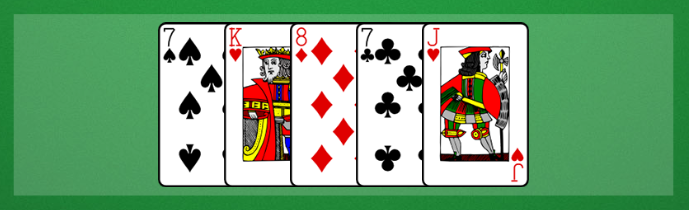
LinearLayout spaces its /components dynamically based on its dimensions, the /components dimensions, and the user defined spacing. Additionally, an orientation and alignment may be specified. In this image a LinearLayout is used to visualize a hand of cards:
Satchel
A satchel hides its /components and reveals them, when they are removed. This container can be used to visualize an entity, where the user should not know what might get drawn next, or what is in the container.
HexagonGrid
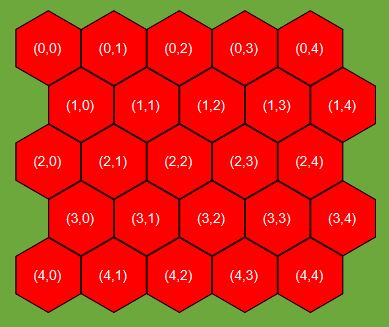
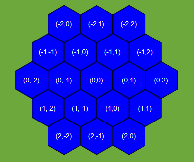
Represents a grid of hexagons in a coordinate system. Each hexagon can be accessed and manipulated using column and row indices.
Coordinate Systems
The HexagonGrid class supports two coordinate systems: offset and axial.
Offset Coordinate System
In the offset coordinate system, the hexagons are positioned using a grid of rectangular offsets. Each hexagon occupies a rectangular cell, and the coordinate values represent the row and column indices of the hexagons in the grid.
Axial Coordinate System
In the axial coordinate system, the hexagons are positioned using axial coordinates. Each hexagon is defined by two axial coordinates: q (column) and r (row). The axial coordinates represent the column and row indices of the hexagons in the grid.
Example
val hexagonGrid: HexagonGrid<HexagonView> = HexagonGrid()

for (row in 0..4) {
  for (col in 0..4) {
    val hexagon = HexagonView(visual = ColorVisual.RED)
    hexagonGrid[col, row] = hexagon
  }
}
Here is an example on how to change the default coordinate system to axial.
val hexagonGrid: HexagonGrid<HexagonView> = HexagonGrid(coordinateSystem = CoordinateSystem.AXIAL)

for (q in -2..2) {
  for (r in -2..2) {
    if (q + r >= -2 && q + r <= 2) {
        val hexagon = HexagonView(visual = ColorVisual.BLUE)
        hexagonGrid[q, r] = hexagon
    }
  }
}
Hexagon Grid Orientations
The HexagonGrid class supports two orientations: pointy top and flat top.
Pointy Top Orientation
This is the default orientation for a HexGrid. In the pointy top orientation (HexOrientation.POINTY_TOP), the hexagons are positioned with their tips pointing up and down.
Flat Top Orientation
In the flat top orientation (HexOrientation.FLAT_TOP), the hexagons are positioned with their tips pointing left and right.
Container overview
Complete source code for the example
fun main() {
  AreaExample()
}

class AreaExample : BoardGameApplication("Area example") {
  private val gameScene: BoardGameScene = BoardGameScene(background = ColorVisual.LIGHT_GRAY)

  private val numberOfComponentsLabel: Label = Label(width = 400, posX = 50, posY = 50)
  private val area: Area<TokenView> = Area(100, 400, 50, 100, ColorVisual.DARK_GRAY)

  private val greenToken: TokenView = TokenView(visual = ColorVisual.GREEN)
  private val redToken: TokenView = TokenView(visual = ColorVisual.RED)

  init {
    area.onAdd = {
      this.resize(100, 100)
    }
    area.onRemove = {
      this.rotation += 45
    }

    area.addComponentsListener {
      numberOfComponentsLabel.label = "Number of /components in this area: ${area.numberOfComponents()}"
    }

    area.add(greenToken)
    area.add(redToken, 0)

    area.remove(redToken)

    gameScene.addComponents(area, numberOfComponentsLabel)
    showGameScene(gameScene)
    show()
  }
}